Software developer at a big library, cyclist, photographer, hiker, reader. Email: chris@improbable.org
24084 stories
·
214 followers

Help us invent CSS Grid Level 3, aka “Masonry” layout

1 Share

If you’ve been making websites for years, you know how frustrating it was to lay out a web page with CSS floats. Managing sizes and placement was tedious and time consuming. Being creative was often impossible. CSS Grid greatly eased that pain with Grid Level 1 in 2017, and now with Grid Level 2, aka Subgrid. But even with the powerful CSS of today, not every layout imaged by designers is possible. In fact, when CSS Grid shipped, one of the most commonly asked questions was: “how do I write CSS to accomplish a masonry layout?” Sadly, for the last seven years the answer has been — you can’t.

What is masonry layout?

What do we mean by the term “masonry layout”? Basically it’s the pattern seen in the following image — where content packs together like a brick or stone wall. That’s where it gets the name “masonry”. It’s also frequently called “waterfall layout”, as a metaphor for how content flows down the page like a waterfall.

Two dozen photos of different aspect ratios laid out using a "masonry" pattern

This layout is popular because it solves a few problems that other layouts do not.

  1. It allows for content of different aspect ratios, and avoids the need to crop or truncate content in order to turn everything into uniform rectangles.
  2. It distributes content across the page (instead of flowing down each column, one by one). This follows the natural reading order as you scroll the page. And it lets the website lazy-load additional content at the bottom without moving existing content around.

This layout creates uniformly-sized columns, without any rows. It’s quite possible that because this layout has required JavaScript, anything more creative or complex has been too hard to pull off — and we’ve been left with an expectation that masonry layout should only ever be a simple pattern with uniformly-sized columns. Let’s see what’s possible if we build it into CSS instead.

Inventing masonry

A mechanism in CSS for “masonry layout” was first proposed by Mozilla in January 2020 as an extension of CSS Grid, and implemented as an experiment behind a flag in Firefox Nightly. In 2022, Apple started implementing this CSS Grid Level 3 proposal in Safari Technology Preview (where it’s currently on by default), and we’ve been helping to move the web standard along to reach maturity.

However, there are big questions still being asked about how CSS should handle masonry-style layouts. Some people remain skeptical that this capability should be part of CSS Grid, and want it to instead be its own separate display type. Others are questioning whether or not this kind of layout is needed on the web at all — they aren’t sure that well-known websites will use it. With such fundamental disagreements at play, no browser can ship. We must first come to consensus in the CSS Working Group.

This is where we need your help. We’d like real-world web designers and developers to weigh into the discussion, and express what it is that you want. Your input really can make a difference.

In this article, we’ll walk through how the CSS Grid Level 3 proposal works, and how you can use its new capabilities. We’ll show you why we believe these features should be part of CSS Grid, and explain what the alternative would be if the CSS Working Group creates display: masonry instead. And then, we’ll ask you to join the debate to help move us forward. Please do read to the end.

Four demos

To show why we at Apple believe this capability should be part of CSS Grid, we created four demonstrations. If you’d like, try them yourself at webkit.org/demos/grid3. View these demos in a browser that supports Grid Level 3 — currently Safari Technology Preview or Firefox after you’ve turned on the feature flag.

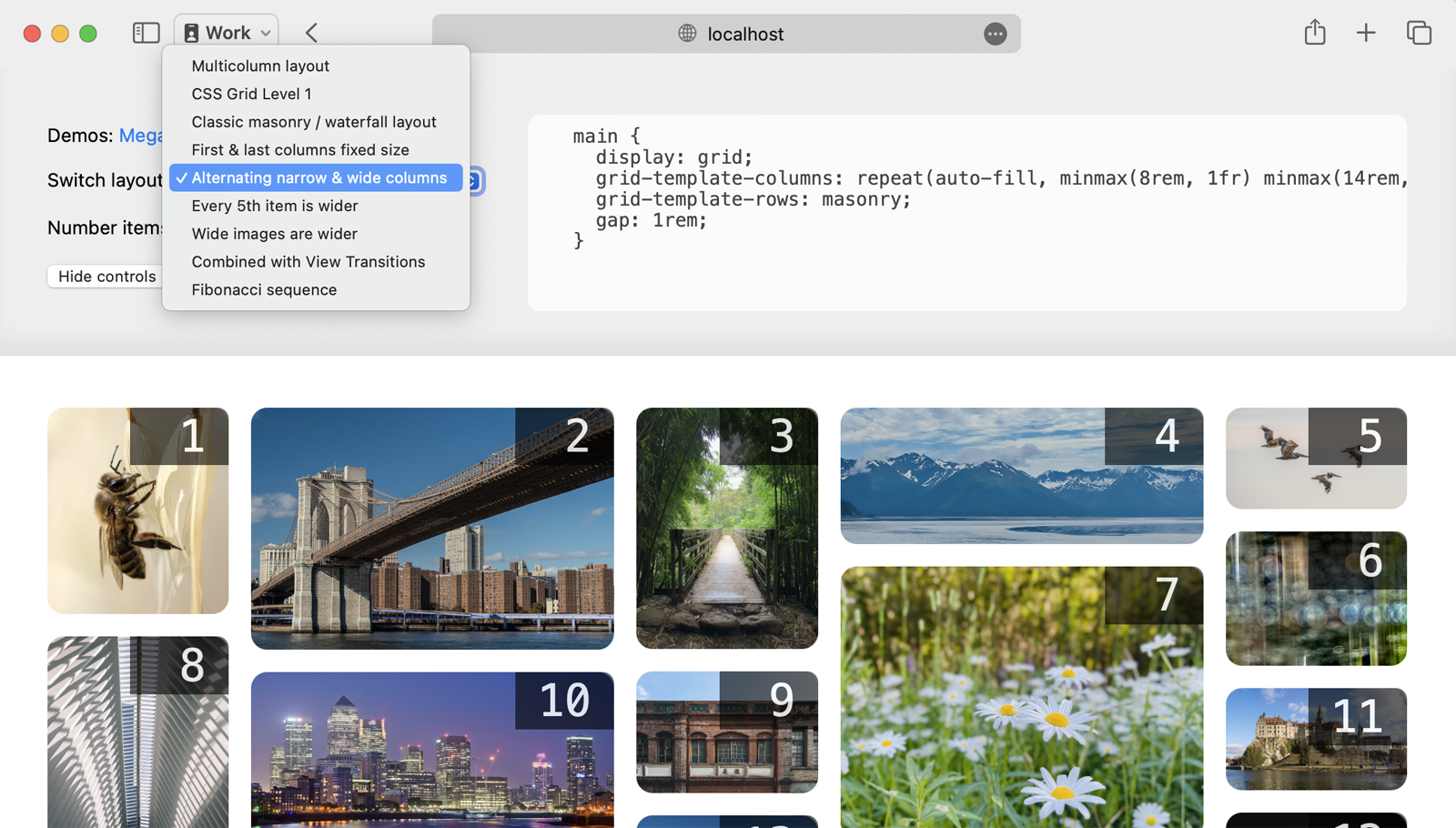
Note there’s a control panel for each demo, with the relevant layout code printed to the page. Turn on “Number items” to see the relationship between the HTML order of content and the layout placement of that content.

Screenshot showing the controls of the demo — here with the numbers turned on

Each demo has a multitude of variations. Switch between variations from the dropdown menu, which changes only the CSS. The HTML stays the same.

Screenshot showing the controls of the demo — here with the dropdown of various alternative layouts showing

Creating a classic masonry / waterfall layout

First, let’s take a look at how to build a classic masonry/waterfall layout. In this gallery of photos, each image is wrapped with a figure element, and the figures are direct children of a main element.

<main>
  <figure><img src="photo-1.jpg"></figure>
  <figure><img src="photo-2.jpg"></figure>
  <figure><img src="photo-3.jpg"></figure>
</main>

We start by applying display: grid to the main element to create the Grid container. Then we can define grid-template-columns however we’d like.

In this case, let’s use grid-template-columns: repeat(auto-fill, minmax(14rem, 1fr)) to ask the browser to repeat a looped definition to create a set of flexible columns that are each of a minimum of 14rem. This results in uniformly-sized columns, typical of the classic masonry/waterfall layout. The gap: 1rem; rule creates a 1rem-wide space between the items — both between the columns, and horizontally between items.

And then, we’ll define the “rows” with the masonry value. (It’s likely the name of this value will change before this ships in browsers — more on that at the end of this article. For now, masonry is what works.)

main { 
  display: grid;
  grid-template-columns: repeat(auto-fill, minmax(14rem, 1fr));
  gap: 1rem;
  grid-template-rows: masonry;
}

The grid-template-rows: masonry rule tells the browser: “Please do not create rows. Instead pack the content into a masonry/waterfall-like pattern.”

That’s it! In four lines of CSS, with zero media queries or container queries, we’ve created a flexible layout that works on screens of all sizes. And there’s no need to crop content to force everything into same-sized boxes.

masonry layout of photos

In graphic design, a layout that has uniformly-sized columns and no rows is often called a “symmetrical columnar grid”. For centuries, columnar grids were the dominant type of grid used in page design.

Leveraging Grid’s full power to define columns

Now let’s dive into the advantages of combining the full power of CSS Grid with masonry/waterfall packing. CSS Grid provides many options for defining grid our columns. Using fr units to create a symmetrical grid is only one option of many.

How could these possibilities be used for a masonry/waterfall-style layout? Let’s try mixing fixed-sized columns with flexible columns. We could make the first and last column fixed-sized, while the middle columns are flexible, changing in both size and number.

Specifically, the first and last columns are exactly 14 characters wide, while the middle columns are flexible (at least 28 characters wide) and change in number to fill the available space.

main { 
  display: grid;
  grid-template-columns: 14ch repeat(auto-fill, minmax(28ch, 1fr)) 14ch;
  grid-template-rows: masonry;
  gap: 1rem;
}

This is just one of many, many possibilities.

CSS Grid allows for a lot of creativity with its options for defining grid tracks:

  • fixed sizes defined in any unit (px, em, rem, cqi, lh, ch, ic, cap, vw, svh, and many more)
  • max-content and min-content
  • the full power of fr units
  • minmax() functions
  • %-sized
  • auto

These options in CSS Grid allow you to create something much more dynamic and flexible in interesting ways. You can create two stages of flexibility, because the fr-unit sized columns grow and shrink in a separate stage from the minmax()-sized columns. The max-content and min-content values let you size the columns based on the content size, rather than sizing the content based on the column size. The fr units can easily be used to create compound or asymmetrical grids, where the columns are different sizes. The options are endless.

By adding the ability to pack content in a masonry/waterfall pattern to CSS Grid, we maintain the full power of Grid for defining our columns in whichever manner we like.

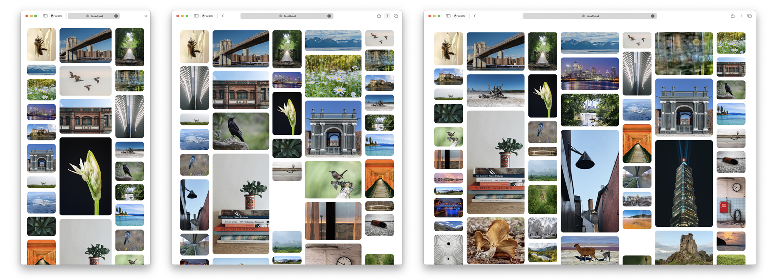
For example, let’s use grid-template-columns: repeat(auto-fill, minmax(8rem, 1fr) minmax(16rem, 2fr)) minmax(8rem, 1fr) to create a pattern of alternating narrow and wider columns, where all the columns are flexible. More columns are added when there’s space. And there’s always an odd number of columns, ending with a narrow one.

three web browser windows next to each other, showing how the layout adjusts for narrow, medium and wider windows

Even when we define columns using only the simple fr unit, the full power provided in CSS Grid means different columns can be set to different sizes. For fun, let’s use fr units to define a set of columns sized to inject the vibes of the golden ratio by using the Fibonacci sequence in grid-template-columns: 1fr 1fr 2fr 3fr 5fr 8fr;

layout of photos where the columns on the left are very narrow, getting bigger and bigger as them move to the right, in a fibonacci sequence

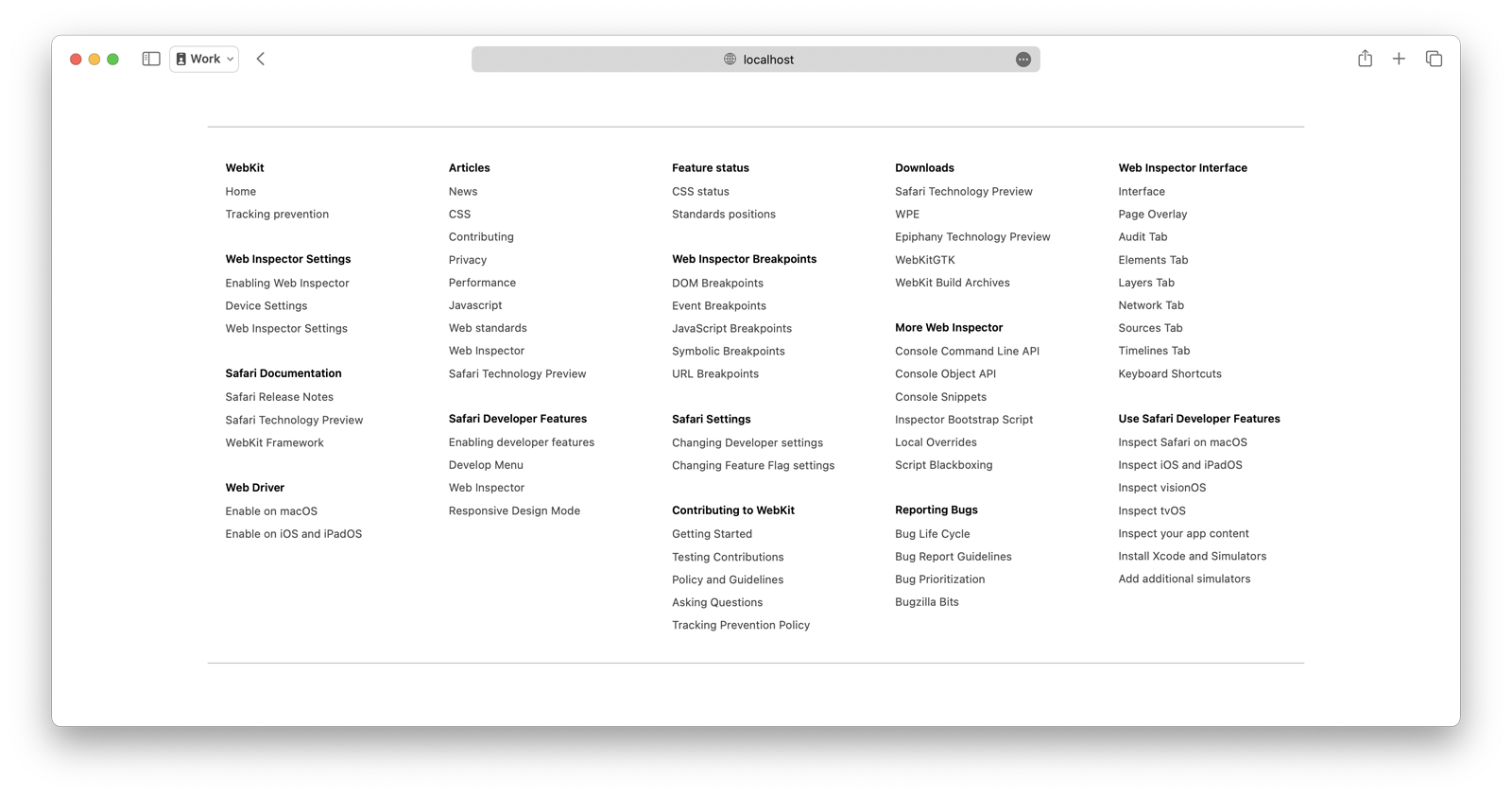
In a more practical example, let’s use max-content when defining our columns. Content-based sizing is an incredibly power feature of CSS Grid. This demo of a mega menu layout uses grid-template-columns: repeat(auto-fill, minmax(max-content, 30ch)); to ensure that every column is big enough to fit every link without wrapping text.

a menu with a ton of links, like in a website footer, laid out with Grid Level 3

Mega menus have been hard to code, especially across multiple screen sizes. With CSS Grid Level 3, it becomes incredibly easy. A few lines of code creates a dynamic layout which adds and removes columns one at a time as space allows — without any media/container queries, and with wrapping prevention.

Many of these examples could never be created with masonry as a separate display type. The discussion of display: masonry is to only allow symmetrical columns (columns that are the same size as each other), much like multicolumn layout does today.

Leveraging Grid’s ability to let content span columns

CSS Grid also lets us span items across multiple columns. Let’s use that capability to see what interesting options might emerge. How about making every 5th image span two grid columns, while the rest of the images are span one column.

same photo layout, now with random photos being bigger

What if instead, we put a wider class on specifically on images that have a wider aspect-ratio, to make those images span multiple columns. We can also change the styling a bit, making the corners square instead of round, and reducing the grid gap to zero. This gives us a different way to pack photos of different aspect ratios together.

another layout of image, this time where wider images are wider

We also experimented with combining the classic masonry/waterfall layout of photos with View Transitions. When a user clicks/taps on any photo, it grows to span multiple columns. The browser automagically animates the transition. (This demo requires Safari Technology Preview 192 or later.)

These variations of the Photos and Mega Menu demos are just a small taste of all of the many possibilities you get when leveraging the full power of CSS Grid in the column direction, while simultaneously turning off rows.

Columnar vs. Modular Grids

What happens when we keep experimenting? Let’s let go of thinking about “masonry”, and start imagining Grid Level 3 purely as an expansion of Grid. At its core, CSS Grid Level 3 provides a mechanism for turning off rows. It lets us create a columnar grid — a grid that’s made up of columns alone.

By contrast, a modular grid is a grid where everything is lined up in both columns and rows. They became popular in the 20th century during the dominance of modernism in graphic design. CSS Grid Level 1 is really good at making modular grids… that’s what it wants to do. In fact, float-based layouts also encouraged the creation of modular grids on the web, since you had to make all your content the same height to get your floats to clear. Images need to be the same aspect ratio. Text has to be the same length. This is often accomplished on the back-end with policies enforced by the content management system, or on the front-end by CSS that truncates/crops the content.

It’s incredible common for websites to do some variation of this sort of modular grid, laid out here with CSS Grid Level 1.

layout of text, in ridged sets of boxes, row after row, all the same height

Of course, this example is overly simplistic. The article ledes look bare with no teaser images. The uniformity is so strict and formal, the design lacks life. Real websites find other ways to breathe life back into the design.

But what if the layout itself could also provide some vitality and interest? What will happen if we use CSS Grid to create a columnar grid as easily as it creates a modular grid? What if we don’t truncate content, and instead let it be the size that it wants to be — and get the layout to work for the content, rather than forcing the content to work for the layout?

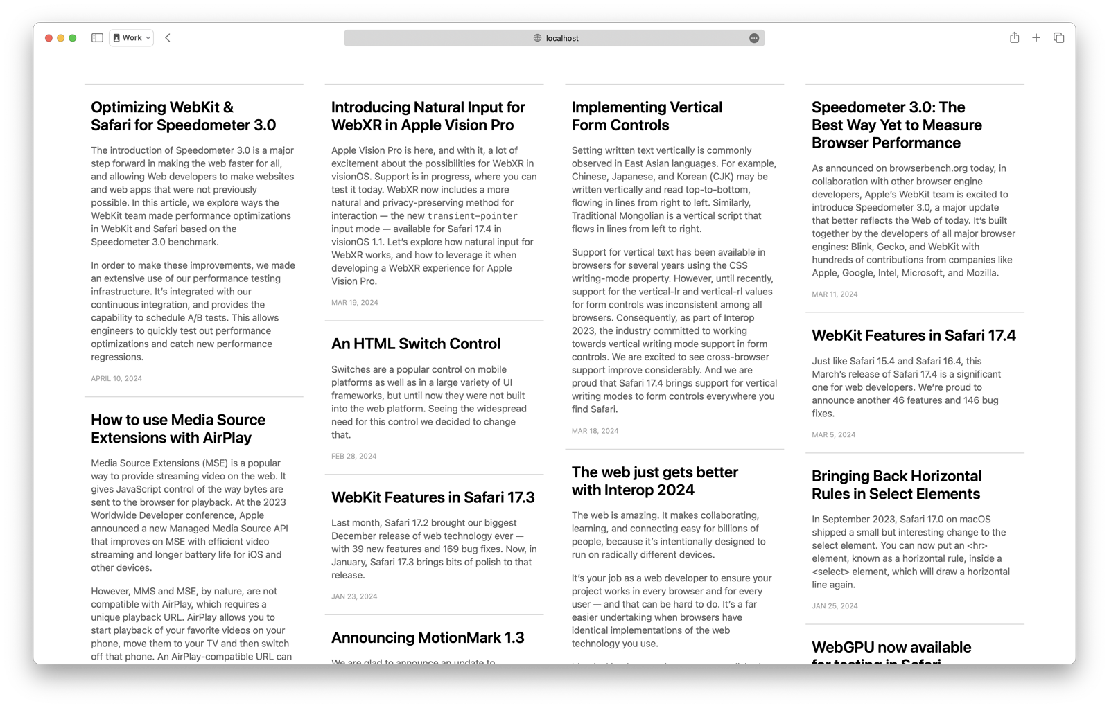
A classic masonry/waterfall layout with various lengths of text looks like this, which is already more engaging since a user can read more about each article:

same article teaser text, this time laid out in columns set with masonry

Although, that’s still a bit visually repetitive. Symmetrical columnar grids often are. We need the rest of the power of CSS Grid to do something more interesting. Let’s make the latest article much bigger, and have it span four columns. A handful of other recent articles can be medium-sized and span two columns. While the older content is smaller, spanning one column.

same text, this time laid out with much more dynamic use of 'masonry-style layout plus spanning columns

Now this otherwise visually boring text is starting to look fairly lively. If we were to add images to each of these articles, it would be it even more dynamic.

Let’s experiment with mixing images and text together on a webpage for a museum. The first grid item is a header that introduces the museum, and provides navigation to other resources. The rest of the content consists of pieces of artwork and their information: title, artist, year, medium, catalog number and location.

Because the paintings are gorgeous, the content looks pretty great in a classic masonry/waterfall layout.

layout of cards, each with a painting and text

Let’s see what else we can do by utilizing two more powerful features of CSS Grid — subgrid and explicit placement.

Using subgrid and explicit placement

The functionality provided by subgrid in CSS Grid Level 2 is incredible, and it’s finally supported in most browsers.

Instead of listing the painting’s metadata in a single left-aligned column, let’s see how we might better use the available space. By using subgrid, we can put the year and catalog number on the right of each card — and line up this data for one painting with the same data for the other paintings.

close-up of this layout, with the Grid Inspector showing, with lines marking columns showing how subgrid works

By adding this new functionality to CSS Grid Level 3, we get the benefit of existing developer tools. You can use the Grid Inspector in Safari Technology Preview today as you try out grid-template-rows: masonry.

If masonry is its own display type, and not part of CSS Grid, it will not get the benefit of subgrid.

We can also use the power of CSS Grid Level 1 to explicitly place the header into the last two columns, moving it to the top right corner of the page with grid-column: -3 / -1.

In just a few lines of layout code, we are using the full power of CSS Grid Levels 1, 2, and 3 to create flexible columns that change in number to accommodate the available size — without using any media queries or container queries.

Hopefully you can see the advantages of fully combining a mechanism for masonry/waterfall layouts with CSS Grid — providing many more creative possibilities than masonry alone.

The Debate

So let’s get into the debate that’s been blocking the CSS Working Group from moving forward. Our hope is that web designers and developers chime in (post to social media, write blog posts) with your thoughts about which direction CSS should take.

Some people, including those of us at Apple, like having “Masonry” be part of CSS Grid. We believe this functionality is a mechanism to expand CSS Grid — allowing it to finally create columnar grids as well as modular grids. And we want this functionality to be mixed with all the other features of Grid, including the powerful options for defining a columns, track spanning, explicit placement, and subgrid.

Other people instead believe Masonry should be its own separate display type. At first glance, defining Masonry with a new display type might make a lot of sense. You do get a tidy separation between layout types.

display: block;
display: inline;
display: flexbox;
display: grid;
display: masonry;

The CSS Working Group has not discussed how the syntax for a separate Masonry display type would work, but perhaps it would be patterned after Multicolumn layout.

main { 
  display: masonry;
  columns: 28ch;
}

Or perhaps the syntax would be patterned after Grid, but with significant limitations:

main {
  display: masonry;
  masonry-columns: repeat(5, minmax(28ch, 1fr)); 
                   /* where only one repeating width is allowed */
}

Either way, it’s clear that advocates of this option want Masonry to be limited to a symmetrical grid — where all the columns are the same size as each other. None of the rest of CSS Grid’s track sizing capabilities would be allowed.

Making masonry a simple and separate layout type would avoid the work necessary to keep Grid and Masonry working together in combination — both now and in the long term. Doing this would simplify the layout model, make it easier to implement in browsers, reduce the potential for performance traps, and allow the feature sets of Grid and Masonry to diverge.

Conversely, we believe the effort needed to add this capability to CSS Grid is worth the many benefits to be had. The CSS Grid Level 3 specification has already been written, and implemented in two browser engines. And yes, while making CSS Grid more complex will make it harder to extend in the future, we believe there’s an advantage to having these two types of grid layouts intertwined. This way the CSS Working Group will always define all new additions for both modular and columnar grids. There won’t be something added to display: grid that will be left out of display: masonry, or vice versa. For example, many developers want CSS Grid Level 4 to provide a mechanism for styling grid areas and grid lines — perhaps a way to add a background color to a track, or create a rule line in a gap. It’d be great to ensure that will work for both modular and columnar grids from Day 1.

Another argument made by advocates of display: masonry is that that masonry is conceptually a fundamentally different layout type from CSS Grid, and therefore should have its own display type. They often describe CSS Grid as inherently being about “lining things up in two-dimensions”, and since masonry only lines things up in one dimension, “it’s not a grid”. (In fact, some have advocated that Masonry is more like Flexbox, since “both line things up in one direction”.)

In many ways, your perspective on this question might depends on what you imagine a grid is.

What is a grid?

Grids are an incredibly important aspect of graphic design. Grids are used to line up text, images and other content in a regular pattern. They help readability and usability by making things predictable.

You can trace their use through thousands of years of history.

two photos of book pages, showing historic columnar layouts from long ago
[Left] Antoine Vérard published a French translation of Boccaccio in 1498. Seen in Thirty Centuries of Graphic Design, by James Craig and Bruce Barton, 1987. [Right] A Russian illustrated sheet proclaiming that ‘Hops are head above all other fruit’. Seen in Books: A Living History by Martyn Lyons, 2011.

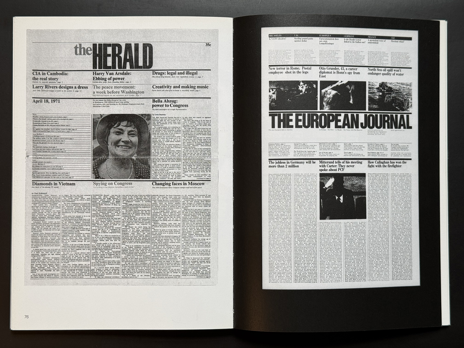
It wasn’t until the 20th century that European and American modernists started promoting the idea that “proper” graphic design grids should line content up in both directions — in rows as well as columns.

spread from a book, showing two different newspaper home pages, where articles line up in a modular grid — in both row and column directions
Massimo Vignelli is especially well-known for promoting the idea that lining things up in both columns and rows is a superior practice of graphic design. Two examples from The Vignelli Canon, 2010.

Even today, there is a lot of debate about which type of grid is the best grid or the only legitimate grid. Many designers claim a 12 column grid is the only correct way to design a web page — or 12 columns for “desktop”, 8 columns for “tablet”, and 4 columns for “phones”. At times designers have gotten quite religious about their ideas of what a “proper grid” looks like.

Mark Bouton argued for years that symmetrical columnar grids are incredibly formulaic and boring. He promoted the use of asymmetrical compound grids in design for the web. Today, luckily CSS Grid Level 1 makes it incredibly easy to create both asymmetrical grids and compound grids, giving designers the freedom to create what they want. But only if they also want all their grids to be a modular grids.

Both modular and columnar grids are in fact grids. And CSS Grid deserves the ability to also create columnar grids.

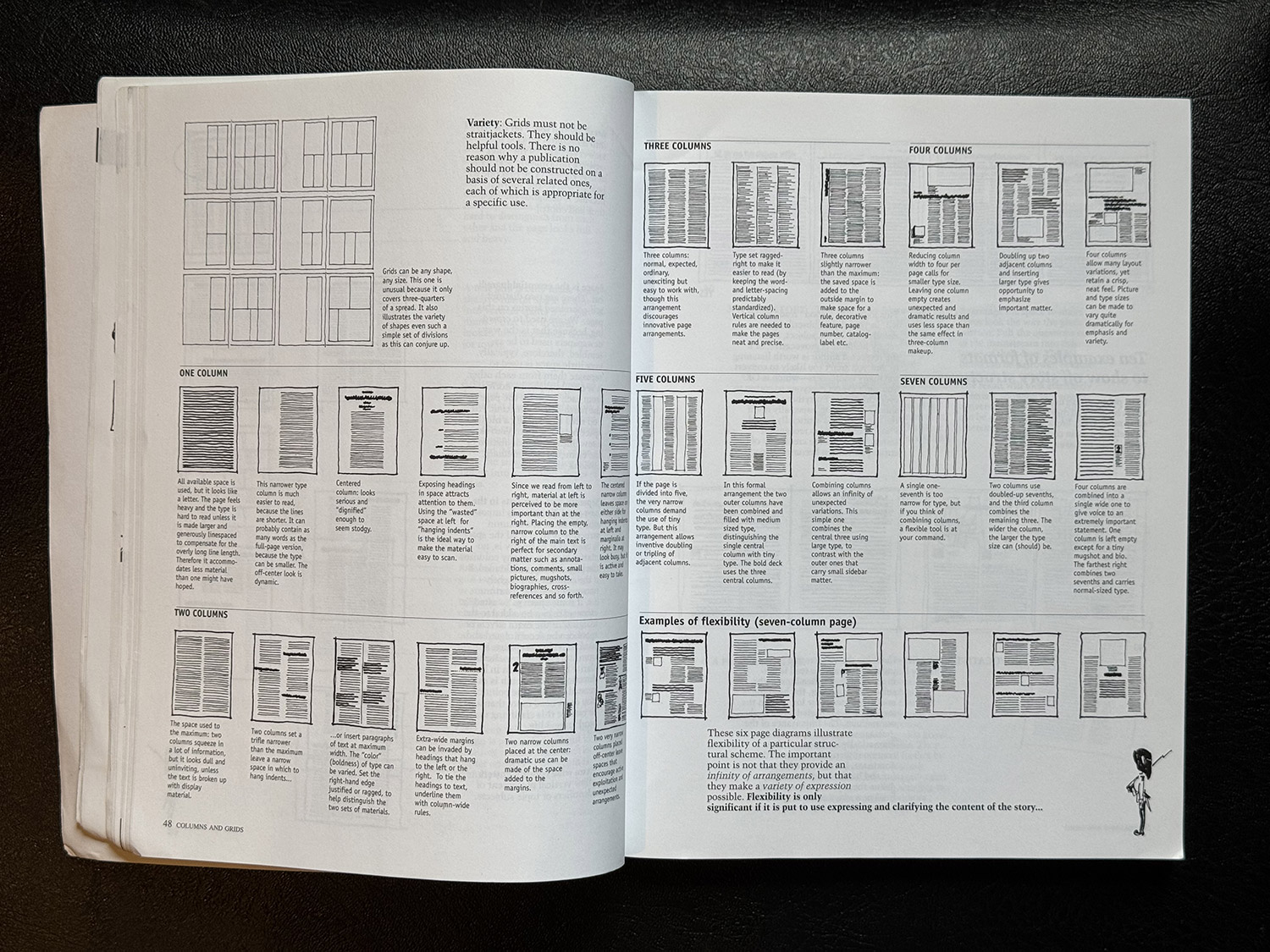
photograph of an open book, showing many many hand-drawn diagrams of how different layouts can use different numbers of columns
Ideas for designing columnar grids, in Editing by Design, by Jan V. White.

We believe there’s an opportunity for CSS to enable a rich history of design grids to come to the web — and would be greatly disappointed to see the new masonry feature limited to only allowing symmetrical columnar grids.

But what do you think?

We want to hear from you

This is where you come in. Try some demos of your own. Write about your thoughts on your own blog. Comment at the CSS Working Group in this issue.

  • Should “masonry”/“waterfall” be part of CSS Grid?
  • Do you want the capabilities to define a columnar grid with CSS Grid — to use subgrid, spanning, explicit placement, and all the many options for track sizing? Or do you only want the ability to define a classic masonry layout with equal-sized columns?
  • Will you use this? What might you create with it?
  • Do you have links to demos you’ve made? We want to see your ideas and use cases.
  • Are there things you want to do that you can’t do with this model?

Often, thinking about something theoretically and actually seeing it in use can be very different. To make sure the CSSWG gets the design of this feature correct, we need developers to gain some hands-on experience, and articulate your thoughts about what it’s like.

The WebKit team has been working on Masonry for a year and a half. It was first enabled by default in Safari Technology Preview 163 in February 2023. There’s a bit more polish needed, and details to work out (naming being one). But we would like to ship this feature soon. To do so, these fundamental questions need to be resolved.

Thank you for your help!

P.S. About the name…

It’s likely masonry is not the best name for this new value. Names in CSS are usually simple words that directly describe the result they create — like center, under, contain, clip, revert, ltr, always, break-word, hidden, allow-end, scale-down, wrap, smooth.

The word “masonry” is more of a metaphor, where the meaning has to be explained with a backstory. Such a term is harder to remember for developers who do not speak English. And arguably, the syntax could just as easily be grid-template-rows: waterfall instead, since that’s the dominant word for this layout used in certain regions, not masonry.

Plus, once you start to write a lot of code using this feature, it’s likely you’ll come to the realization that we did — this really isn’t about the layout used by Pinterest or other similar sites. This is a mechanism for telling the browser, “please create a grid, but without any rows.

Perhaps the best syntax could be grid-template-rows: none; to convey “please do not give me any rows”. Sadly, it’s too late to use this name, because none is the default value for grid-template-* and means “please give me only implicit rows, no explicit ones”.

Instead we could use the name off to convey “please turn off the grid in the row direction, and give me only columns”.

main { 
  display: grid;
  grid-template-columns: repeat(auto-fill, minmax(14rem, 1fr));
  grid-template-rows: off; 
}

The CSSWG is debating this name in this issue. If you have ideas or preferences for a name, please join that discussion.

Meanwhile, masonry is the value that is currently implemented in Safari Technology Preview, since that’s what the Editor’s Draft currently uses. And so that’s what we used in our demos above, and what you should use in yours. But do expect the name of this value to change in the future. And perhaps prepare for a future where we call this “columnar grid” or “Grid Level 3” instead of “Masonry”.

Read the whole story
Share this story
Delete

Many years after Oklahoma City bombing, the GOP still hasn’t learned to reject extremism

1 Share

Twenty-nine years after killing 168 people in the bombing of the Alfred P. Murrah Federal Building in Oklahoma City — the deadliest act of domestic terrorism in U.S. history — Timothy McVeigh is dead and buried.

But the extremism that fueled his hate on April 19, 1995, is alive and unencumbered in today’s conservative movement.

But the extremism that fueled his hate on April 19, 1995, is alive and unencumbered in today’s conservative movement.

In many ways, McVeigh embodied the threats of political violence and radicalization presently gripping conservatives — and thus, the rest of the U.S., too. I think of McVeigh as connecting the eras of white domestic terrorism that characterized the 20th century and the more recent strain of extremism infecting the MAGA movement.

In 2018, for example, historian Kathleen Belew wrote that the Oklahoma City bombing ought not be seen as the act of a “lone wolf” but, rather, in its proper context:

McVeigh, who was executed in 2001, wasn’t a lone wolf. He was one among a pack. And his death appears only to have spawned other extremists.

An ABC News report in 2020 cited FBI records showing that several people who’d been arrested in the three years prior for suspected links to domestic terrorism or violent white supremacy had been known to make references to McVeigh.

In 2017, the Southern Poverty Law Center reported on a disturbing trend of “McVeigh worship” playing out in extremist circles.

And during a Democratic-led House hearing two years ago on the trend of veterans embracing violent extremism — as was the case during the Jan. 6 insurrection — the Oklahoma City bombing’s toxic influence as a source of inspiration came up, as well. (McVeigh was a decorated veteran of the Persian Gulf War.)

Even in Oklahoma, where one would hope that the memory of the 1995 bombing would deter potential copycats, the threat of other attacks seems to loom large.

Last summer, after right-wing activist Chaya Raichik’s popular social media account shared a video targeting a school librarian, a Tulsa-area school district was targeted with bomb threats for six days straight.

The video was promoted by Oklahoma’s schools superintendent, Ryan Walters, who in January awarded Raichik with a job as an adviser who will have a say in what content is deemed appropriate for school libraries.

And I think that’s a perfect example of how intractable the problem of far-right extremism has become in this country.

Nearly 30 years after McVeigh’s deadly bombing, Republicans — even those in Oklahoma — seem to have learned the wrong lessons. Instead of rejecting violent extremism and rooting it out of their ranks, they’ve just devised ways to use it to their advantage.

Read the whole story
Share this story
Delete

Why Ukraine’s Fight Must Continue | Institute for War and Peace Reporting

1 Share

My friend, a writer, texted last night from his trench to say a gentle goodbye. His unit is expecting an attack anytime, but they do not have the heavy artillery they need to repel the assault.

I am thousands of miles away from Ukraine, on a six-city lecture tour across the United States, addressing public meetings and briefing members of Congress. 

But, as with that text, the war stays with us Ukrainians wherever we may travel. No matter how comfortable the hotel, or pleasant the weather, rest is impossible when back home, the delay in delivering crucial arms is costing the lives of our friends, our relatives, our countrymen.

This 60 billion US dollar package has been stalled for months by what, for Americans, is domestic politics; for us Ukrainians, it is an urgent matter of life and death.  

In my public and private meetings here, I am frequently asked: Since Ukraine cannot expect to defeat Russia on the battlefield, shouldn’t it accept a land deal for peace? Won’t more arms just mean more death?

Indeed, Ukraine has seen far too much death – I know, because my colleagues and I see it daily.

"This is a war for the basic values of human rights, of democracy, of liberty."

Since 2014, my organisation and I have documented war crimes by Russian forces occupying my country. Since the full invasion, the scale of crimes escalated exponentially, and we created a national network of groups to continue the work. We have documented killings, rape and torture – beatings, peeling off fingernails, genital electric shock. One woman I interviewed had her eye extracted by a spoon. 

To date, we have documented 68,000 crimes. Yet this is only the tip of the iceberg, because such crimes are central to both the method and the purpose of the invasion.

The Russian position, as the president has made repeatedly clear, is that Ukrainian language and Ukrainian culture, that Ukraine and Ukrainians, do not exist. 

But a premature deal would be wrong – not least because we tried it already, and it failed. 

In 2014, Russia seized Crimea and part of the Donbas. Ukraine was not able to respond effectively, and the international response was muted. A cease-fire was then agreed. All Russia did was use the next eight years to prepare forward bases for the next attack. Emboldened by success, Moscow will only do the same again.

An early deal would also be immoral. You do not make peace by disarming the country which has been invaded. That is not peace but capitulation and occupation. After ten years of documentation, we know what that means. 

In a de-occupied area of the Kharkiv region, after the Ukraine army pushed Russian forces back, the body of beloved Ukrainian children’s writer Volodymyr Vakulenko was discovered in an unmarked grave in the Izyum woods. After extensive investigation, the Russian soldiers responsible for this crime have recently been identified. 

Why kill a children’s writer? Russia kills Ukrainian civilians because it can. After decades of brutal warfare – in Chechnya, in Syria and beyond – it has never been halted. It has never been held accountable. In Ukraine today, we know that such crimes continue in the occupied territories every day.

Russia is increasing its assaults on Ukrainian civilian infrastructure, and we expect a major new attack this summer. Our capital city, my home, could again be under direct threat.  

Meantime, destabilisation activities are under way against Moldova and other neighbouring countries. Moscow has no defined or limited external borders. This nightmare – this endless cataloguing of human pain – will only continue.

The solution is to defeat Russia and this authoritarian ideology, to hold it to account. A stand must be made, and Ukrainians are bravely making it. It is very difficult, creates huge strains in society and comes at a high cost. War is horrible. But Ukrainians know what Russia brings, and the clear majority of the population – nearly 70 per cent – support continuing the fight. 

We respect American politics. We know every country has its own priorities and financial issues. We are grateful for the generous support we have received so far from the US, Europe and other countries around the world, both from governments and ordinary citizens.

But now we need more help, and we need it soon. Ukraine wants peace more than anyone. But we cannot fight evil with empty hands.

Strengthen Ukraine, let us pursue the war as far as we can – our vision is to the internationally recognised 1991 borders – and then we can discuss peace. Our friends in Russian human rights groups tell us the same: the best way to help Russian democracy is to defeat its militarism in Ukraine. 

This is not a war for land. It is a war for survival. Not just of the Ukrainian people, but of the basic values of human rights, of democracy, of liberty. The majority of American people know this and support more aid for Ukraine. The majority of members of Congress agree.

I continue to get text messages from the front every night. Will the US send fresh arms before it is too late? 

Oleksandra Matviichuk, a human rights lawyer and Board member of the Institute for War & Peace Reporting, heads the Kyiv-based Center for Civil Liberties, co-winner of the 2022 Nobel Prize for Peace.

An edited version of this article first appeared in the Financial Times

Read the whole story
Share this story
Delete

Constraining global transport of perfluoroalkyl acids on sea spray aerosol using field measurements | Science Advances

1 Share
Read the whole story
Share this story
Delete

Sticks and Stones - by Michele Banks - Artologica

1 Share

Next month I will be showing my work at Artomatic, an enormous, non-juried art event held in an empty office building in downtown Washington, DC. Artomatic has been held in and around DC eleven times since its founding in 1999 in an old laundromat, which inspired its name. I showed at six of the previous Artomatics and was deeply involved as a volunteer organizer for many years, until I decided that I was doing too much unpaid work.

Over the years, I have tried to become more strategic about my art career, rather than just grabbing opportunities as they come along. So when the announcement came out that Artomatic was back for the first time since 2017, I hesitated. Would I get sucked into the volunteer vortex again? Did it make sense to participate in a non-juried show, which would never be considered prestigious? (Like colleges, art shows are ranked according to how many applicants they exclude, and Artomatic is open to all comers)

I talked myself alternately into and out of it. Gradually, as more and more of my local artist friends signed up, I warmed to the idea. Vowing that I would keep firm boundaries on my time, I registered, although I still felt conflicted.

Then something happened.

After deciding to write this letter, I remembered that The Washington Post’s art critic had once written a scathing review about an Artomatic where I had shown my work. I thought I would go back and look at it for laughs. Well, I found it, but I didn’t laugh.

I’m going to share a few excerpts here, from “Artomatic 2004: Hanging Is Too Good for It” by Blake Gopnik, in the Washington Post, November 11, 2004.

Here's a fine idea. Let's find an abandoned school and then invite local dentists to ply their trade, free of charge, in its crumbling classrooms, peeling corridors and dripping toilets. Okay, so maybe we won't get practicing dentists to come, but we might get some dental students, hygienists and retirees to join in our Happy Tooth festival. What the heck, let's not be elitists here: Why don't we just invite anyone with a yen for tooth work or some skill with drills to give it a go. Then we can all line up, open wide and see what happens.

I'll be at the front of the line.

After all, it could hardly be more excruciating than this year's Artomatic, the fourth edition of the District's creative free-for-all, which opens tomorrow. Organizers have gotten about 600 local "artists" -- anyone who could ante up the $60 fee and 15 hours of his or her time, in fact -- to display their creations. …

The result is the second-worst display of art I've ever seen. The only one to beat it out, by the thinnest of split hairs, was the 2002 Artomatic, which was worse only by virtue of being even bigger and in an even more atrocious space, down by the waterfront in a vacant modern office building.

I won't dwell on the art. And I certainly won't name names. No one needs to know who made the wallfuls of amateur watercolors, yards of incompetent oil paintings, acres of trite street photography and square miles of naive installation art that will be polluting this innocent old building for the next three weeks. There's something for everyone to hate. The rest are works only a mother could love. …

A show like Artomatic, in theory organized and stocked by lovers and supporters of fine art, is actively insulting to all the genuinely talented artists who have managed the long slog to a professional career.

Actively insulting. Never mind that Artomatic 2004 featured artists whose works are now in museums. This type of ugly snobbery and outright cruelty is an absolute gut-punch to artists everywhere. It’s the kind of thing that crawls into your brain and makes you want to quit. And yet. The mean-spiritedness of this review is so extravagant that, in the ten minutes it took me to reread it, I once again became a passionate advocate for Artomatic and other shows like it, events that provide rare opportunities for self-taught artists like me. Filled with the fire that only a completely unfair appraisal can ignite, I am proud to be showing my work at Artomatic 2024.

So congrats, I guess, Blake Gopnik. Twenty years after you took a blowtorch to our efforts, many of us are still here, still making art, still feeling a little bit bad about what you said, and still using your nasty words as powerful fuel. You’ve achieved the same kind of immortality as the tiny, prehistoric creatures in my gas tank.

You can find my work in space 5108C at Artomatic, from March 8 through April 28 at 2100 M Street NW in DC. Please consult the website for opening times and more information. If you can’t make it to DC, you can always shop online

Read the whole story
Share this story
Delete

Amazon ebooks: Are the Mikkelsen twins running a scam? Here’s our investigation - Vox

2 Shares

If you’re a millennial, you may remember that specific moment in time around the late 2000s when streaming video technology had just gotten good but there weren’t that many legitimate streaming platforms available yet. So if you were a student without a TV and you wanted to watch a show, you would go to a website that aggregated lists of illegal streams.

It would be covered in banner ads and autoplaying video ads decorated with little play button arrows, and in order to watch your show, you would have to solve the puzzle of figuring out which play button to click that would actually get you to your show instead of spiriting you away to a website that sold upsetting porn or amateurish video games. It could be done, but you had to be paying attention, and you had to have the barest modicum of web savvy to do it right.

Right now, navigating the ebook and audiobook marketplaces is like being back on those sites. There are a thousand banner ads larded with keywords, and they’re all trying to get your clicks.

Take, for example, when tech journalist Kara Swisher’s Burn Book came out this February. A host of other books hit the Kindle store along with it. They all had bizarre, SEO-streamlined titles, like those new businesses that are named Plumbing Near Me to game the Google algorithm.

“I found ‘Kara Swisher: Silicon Valley’s Bulldog,’ and ‘Kara Swisher Book: How She Became Silicon Valley’s Most Influential Journalist,’ and ‘Kara Swisher Biography: Unraveling the Life and Legacy,’ by a ‘guy’ who ‘wrote’ four biographies this month,” said Ben Smith when he interviewed Swisher for Semaforum.

Swisher was less than flattered by the biographies. “I wrote [Amazon CEO] Andy Jassy and I said, ‘You’re stealing my IP! What is going on?’” she told Smith. (Disclosure: Swisher works for Vox Media.)

Here is almost certainly what was going on: “Kara Swisher book” started trending on the Kindle storefront as buzz built up for Swisher’s book. Keyword scrapers that exist for the sole purpose of finding such search terms delivered the phrase “Kara Swisher book” to the so-called biographer, who used a combination of AI and crimes-against-humanity-level cheap ghostwriters to generate a series of books they could plausibly title and sell using her name.

The biographer in question was just one in a vast, hidden ecosystem centered on the production and distribution of very cheap, low-quality ebooks about increasingly esoteric subjects. Many of them gleefully share misinformation or repackage basic facts from WikiHow behind a title that’s been search-engine-optimized to hell and back again. Some of them even steal the names of well-established existing authors and masquerade as new releases from those writers. According to the Authors Guild, it would be impossible for anyone but Amazon to quantify these books — and that’s not information Amazon is sharing.

All of this means that to buy the book you want — to buy Kara Swisher’s Burn Book instead of Kara Swisher Book: How She Became Silicon Valley’s Most Influential Journalist — you have to know what you’re looking for and pay a modicum of attention to your purchase.

Who wants to do that? Especially in a marketplace like Amazon, where we are trained to buy quickly and thoughtlessly with a single click and where writers have been trained to send their wares without even thinking about it because where else are you going to sell an ebook.

It’s so difficult for most authors to make a living from their writing that we sometimes lose track of how much money there is to be made from books, if only we could save costs on the laborious, time-consuming process of writing them.

The internet, though, has always been a safe harbor for those with plans to innovate that pesky writing part out of the actual book publishing. On the internet, it’s possible to copy text from one platform and paste it into another seamlessly, to share text files, to build vast databases of stolen books. If you wanted to design a place specifically to pirate and sleazily monetize books, it would be hard to do better than the internet as it has long existed.

Now, generative AI has made it possible to create cover images, outlines, and even text at the click of a button.

If, as they used to say, everyone has a book in them, AI has created a world where tech utopianists dream openly about excising the human part of writing a book — any amount of artistry or craft or even just sheer effort — and replacing it with machine-generated streams of text; as though putting in the labor of writing is a sucker’s game; as though caring whether or not what you’re reading is nonsense is only for elitists. The future is now, and it is filled with trash books that no one bothered to really write and that certainly no one wants to read.

The saddest part about it, though, is that the garbage books don’t actually make that much money either. It’s even possible to lose money generating your low-quality ebook to sell on Kindle for $0.99. The way people make money these days is by teaching students the process of making a garbage ebook. It’s grift and garbage all the way down — and the people who ultimately lose out are the readers and writers who love books.

None of this is happening through any willful malice, per se, on the part of the platforms that now run publishing and book-selling. It’s happening more because the platforms are set up to incentivize everything to cost as little as possible, even if it’s garbage.

In a statement, Amazon spokesperson Ashley Vanicek said, “We aim to provide the best possible shopping, reading, and publishing experience, and we are constantly evaluating developments that impact that experience, which includes the rapid evolution and expansion of generative AI tools.”

Yet the garbage books predate the problem of AI. Here’s how they get made in the first place.

The scammy underbelly of online self-publishing

These days, the trash ebook publishing landscape is fully saturated with grifters. There are blogs that talk about the industry, but they tend to be clickbait sites riddled with SEO keywords and affiliate links back and forth between each other. Virtually every single part of the self-publishing grift world that can be automated or monetized has been automated and monetized.

If you look a few years back, however, you find a very different landscape. In the internet of the early 2010s, lots of people were excited about making money with trash ebooks and trash audiobooks, but they weren’t yet all trying to scam one another on top of their eventual readers. They wrote real blogs about the process of the grift with their real human voices. They distinguished between schemes that were “white hat” (following the rules) and “black hat” (violating some terms of service). They compared strategies and teachers of strategies.

According to the blogs of the era, one of the most infamous teachers was a man who went by Luca de Stefani, or Big Luca. Legend had it he held the world record for making the most money using Kindle Publishing in a single day. What set Big Luca’s Self Publishing Revolution course apart from the rest — Big Luca’s “black hat breadwinner video lesson,” per one review — was that he gave his students access to a secret Facebook group where self-publishers organized review swaps and buys.

For the self-publishing grift, good reviews are crucial. The more five-star reviews a book has, the more likely Amazon’s algorithm is to push it toward readers. If you’re mostly publishing trash books, you’re not going to get tons of five-star reviews organically. Big Luca’s Facebook group gave grifters a place to offer to swap five-star reviews or sell five-star reviews for $0.99 a pop. As far as Amazon’s algorithm was concerned, there was no difference between that kind of review and the one a real reader might leave. The results were extremely lucrative.

Luca didn’t invent this formula. He learned it from the OG self-publishing grift course K Money Mastery, now apparently defunct, where he excelled.

Eventually, Big Luca had wrung all the money he could from the self-publishing hustle. He climbed up to the next level of the pyramid and became a teacher, and in 2016, the lore goes, a man named Christian Mikkelsen enrolled in Big Luca’s Self Publishing Revolution.

The Mikkelsen twins are named Christian and Rasmus, and they are 28 years old. They have dark blond hair and blue eyes and meticulously groomed facial hair, and they always seem to be posting to Instagram from luxurious private pools that are also somehow exotic beaches. They have managed, in what must be fairly acknowledged as a feat of branding wizardry, to hold on to the domain <a href="http://Publishing.com" rel="nofollow">Publishing.com</a>, and there they peddle their wares: a course they say can help students make a lifetime of easy cash off the revenue from books they don’t even have to bother to write themselves. If they happen to land a student who wants to write a book in good faith and just doesn’t understand how to sell their book on their own, well, they’re happy to take money from that student, too.

According to a profile in Inc., Christian found his way into the self-publishing world by googling “how to make money online.” His first book was a brief ebook titled How to Be a 4.0 Student in College, Like Me. Big Luca’s method apparently served him well enough that he thought it would be worthwhile to bring his twin Rasmus into the fold.

Together, the Mikkelsens published trash book after trash book, guides to keto and sex and crystals. Then they started running their manuscripts through Google Translate to start selling foreign language editions, an innovation on the old grift that bumped their income into six figures and, after a few months, got Amazon to block their publishing account. The time had come, as Inc. would put it, to “do what entrepreneurs do”: pivot. They started a YouTube channel so they could teach the business of self-publishing to anyone else who wanted to learn. Six months and 1,000 subscribers later, they launched their first paywalled online course.

First it was called Audiobook Impact Academy. Then it was Publishing Life. Now, with AI an ever-more-fashionable buzzword, it’s AI Publishing Academy. It’s always more or less the same method, with a few new tweaks in every new iteration. But the method doesn’t change as much as you might think.

How the garbage books get made: A case study

If you want to take the Mikkelsen course, the first thing you do is sit through their sales pitch. It runs for two hours, and it’s just a video of Christian sitting in a dark room, drinking thirstily from a water bottle as he shows you screencaps of his students’ royalty checks and repeats that he is already rich; he doesn’t have to show you how to make this kind of money. He’s doing it for fun.

Christian’s offer is, he says, unbeatable. He will show you how to produce a book without having to write it. “What used to be the hardest part in the process — which was creating that book that you upload onto Amazon — is now the easiest part, and the most fun,” Christian explains. “Because AI can help do that for you.”

Specifically, AI will write your outline for you. The twins feel that the quality isn’t there on purely AI-generated books yet; they demand better for their readers than AI prose. Still, they say using AI to outline saves their students weeks of researching their own manuscripts.

That AI is part of but not central to the process is a helpful talking point for the Mikkelsens as Amazon strengthens its regulations against purely AI-generated text for sale.

“Last year we began requiring all publishers using our Kindle Direct Publishing service to provide information about whether their content is AI-generated and further reduced the total number of titles that can be published in a day,” said Amazon spokesperson Vanicek. Vanicek added that they have “a robust set of methods” to detect content that violates their guidelines, and they regularly remove those books and sometimes suspend the publishing accounts of repeat offenders.

“The thought of human creativity being overshadowed by robots isn’t exactly the prettiest picture,” Christian wrote in a (suspiciously ChatGPT-sounding) blog post in March. “But we’re here to set the record straight. There are two camps of AI use out there: AI-generated and AI-assisted. They are completely different.”

In April, however, the Mikkelsens announced that they were preparing to launch a new proprietary AI program, Publishing.ai, that they promise will write a manuscript for you, “Soooo much faster than a ghostwriter!”

Under the Mikkelsen model, you also don’t have to pick your own topic. They give you access to keyword scrapers that have pulled trending topics off Kindle and Audible. And once AI is finished with your outline, you can send it over to a ghostwriter to turn into a book for a mere $500. For a 30,000-word book, that works out to a fee of $0.016667 per word. (The Mikkelsens work with a ghostwriting company developed by two former students. There, ghostwriters get hired on a freelance basis and are kept anonymous.)

Once you have your manuscript, Christian promises, the twins will show you how to hire audiobook narrators for a flat $20 fee by haggling their prices down. They’ll introduce you to a network of people who are generous with their five-star ratings and will push your book up the algorithmic Amazon rankings for you. All you have to do is sit back and collect your royalty checks as you rake in month after month of passive income.

As Christian talks, he seems to cast a kind of hypnotic spell. You start to wonder: “Am I stupid for not having invested in ebook publishing before now?” You see five-figure check after five-figure check. A ticking clock turns on. Christian wants to give you a special rate for the course. The course is worth $15,500. The regular price is $6,000. But he’s willing to give it to you for just $1,995 as long as you’re one of the first people to sign up after the webinar ends!

None of what the Mikkelsens are describing here is illegal, but if you know the norms of publishing, you know it’s unethical. As documentarian Dan Olson lays out in a lengthy 2022 deep dive into the Mikkelsens, their method of publishing means developing a book you’re probably not qualified to write. It used to mean paying a ghostwriter starvation-level wages to churn out a manuscript; now it means creating a book likely riddled with misinformation and minimal means of correcting it. It means deceiving readers with fake reviews. (That one can get you kicked off Amazon if you get caught.)

If you aren’t versed in publishing’s industry standards, however, the Mikkelsen model can seem incredibly attractive.

“I was like, ‘Yup, this would be great.’ I was totally vibing with it,” recalls Jennifer (whose name has been changed to protect her privacy), a 37-year-old in Virginia, who signed up for the twins’ course in September. She had recently written and self-published her own book on Amazon, but she wasn’t sure what to do to start promoting it.

The twins’ sales pitch struck her as the perfect solution: She could provide her ideas, people who were good with words could rewrite her draft and polish the whole thing up into a sales-ready package, and everyone would get paid. “I was like, ‘Okay, I’m ready to invest and make this a better thing.”

“It was a very efficient, friendly, interactive webinar,” recalls Cecilia (also not her real name), a Seattle-based 50-year-old who works in the health space. She signed up for the twins’ seminar in September, and she remembers being pleasantly won over by that two-hour sales pitch. It seemed to be so transparent. “It promoted trustworthiness,” she says.

Once Jennifer and Cecilia had turned over their money for the course, both of them changed their minds fast.

“I started listening to the modules,” Jennifer says. “And I don’t know how else to describe them” — there is a long, expressive pause — “but as a jet stream of bullshit.”

“All it does is tell you to buy different products,” Jennifer recalls of the Mikkelsen course. “It’s like there’s nothing that they actually provide themselves, other than ‘Go buy other people’s products’ — and I’m sure they own those too, right?” (We can’t confirm that the Mikkelsens do own the products they recommend, but the ghostwriting company they work with is run by former Mikkelsen students.)

The course cost $2,000, but that wasn’t enough. To get a Mikkelsen-approved topic for your book, you had to pay for access to the software that analyzed Amazon keywords to tell you what was trending. To create the perfect outline, you had to pay for access to the AI that outlined and drafted your book for you. You had to pay for the cover design and for the reviewers. The $2,000 fee was supposed to guarantee you frequent one-on-one calls with a publishing coach, but the coaching calls were mostly about upselling to the premium $7,800 course, Jennifer says.

After a few weeks of phone calls, Cecilia decided she had had enough of the program and asked for her money back. She didn’t expect it would be a problem, since the course was advertised as fully refundable. Customer service reps then told her that, to qualify for a refund, she had to prove she’d sat through the whole course, published a book, and failed to make her money back. She says she had to threaten to call the attorney general before they sent her money back without such proof.

Jennifer wrote off her $2,000 as the cost of learning a bad lesson, but she wanted to warn other people against making the same mistake. She posted a negative review of <a href="http://Publishing.com" rel="nofollow">Publishing.com</a> on the user review site TrustPilot, where it has a 4.7 rating. So did Cecilia. Both of them found their reviews queried by TrustPilot, which required them to submit proof of going through the course in order to keep their reviews up. Most of the course’s five-star reviews, however, remain unverified. I reached out to some of the five-star TrustPilot reviewers to get their take on the Mikkelsens’ course, but I never heard back from any of them.

After the Mikkelsens’ course got big, the rumors on Reddit say Big Luca was furious that they’d ripped off his business model. He used to brag that he was going to drag them into court. Instead, he got out of the self-publishing game.

Now he runs a program called Big Luca International or, more informally, School for the Rich, self-described as “the world’s leading company in online marketing training.” It’s supposed to teach you how to monetize any online business — the self-publishing black hat breadwinning tricks, extrapolated out to all the other industries of the internet. With the advent of AI, it’s easier than ever to flood the whole digital ecosystem with trash in pursuit of passive income.

The neverending grift

“It sucks that I did this,” Jennifer says of her experience at AI Publishing Academy. “But I mean, it’s put some fire under my butt to do it [marketing] myself for my own books.”

Jennifer didn’t set out to make a quick buck with a garbage ebook. She did the work of writing a book because she believed in it. The Mikkelsens got her because she couldn’t figure out how to sell her book on her own, and part of the reason she couldn’t sell it is because the marketplace is already so flooded with books. Many of which are garbage books.

The Mikkelsens are not the chief villains of this story. They are small-time operators working one level of a very big grift industry. The grift is that technology and retail platforms have incentivized a race to the bottom when it comes to selling books. Together, without ever caring enough about the issue to deliberately try to do so, they have built a landscape in which it’s hard to trust what you read and hard to sell what you write.

The incentives of the modern book-selling economy for writers are to keep your costs low, low, low and your volume high, high, high, and definitely put your book on Amazon because where else are you going to sell an ebook? The incentive of the modern book-buying economy for readers is to go onto Amazon and lazily click around with a few search terms, and then buy the first book that looks right with the click of a single button. The incentives are, in other words, driving us all straight into a flood of garbage.

That’s what the grift does. It finds every spot in the process of making and selling a book that is inconvenient or laborious, and it exploits those spots. It exploits our cultural belief that books are meaningful, that writing a book is a valuable act, that reading a book will enrich your life. When it’s finished, you’re left with something that’s not a real book but a book-shaped digital file filled with nothing of any use to anyone at all.

Read the whole story
Share this story
Delete
Next Page of Stories